
In 2025, having a WordPress website is not enough. Your website needs to be responsive—meaning it works seamlessly on mobile devices, tablets, and desktops.
Why? Because over 60% of website traffic comes from mobile users, and search engines like Google prioritize mobile-friendly sites in rankings.
If your website isn’t responsive, you’re likely losing visitors, customers, and conversions.
In this post, I’ll break down why responsive design matters, why WordPress is a great platform for it, and how a well-built site impacts everything from user experience to lead generation.
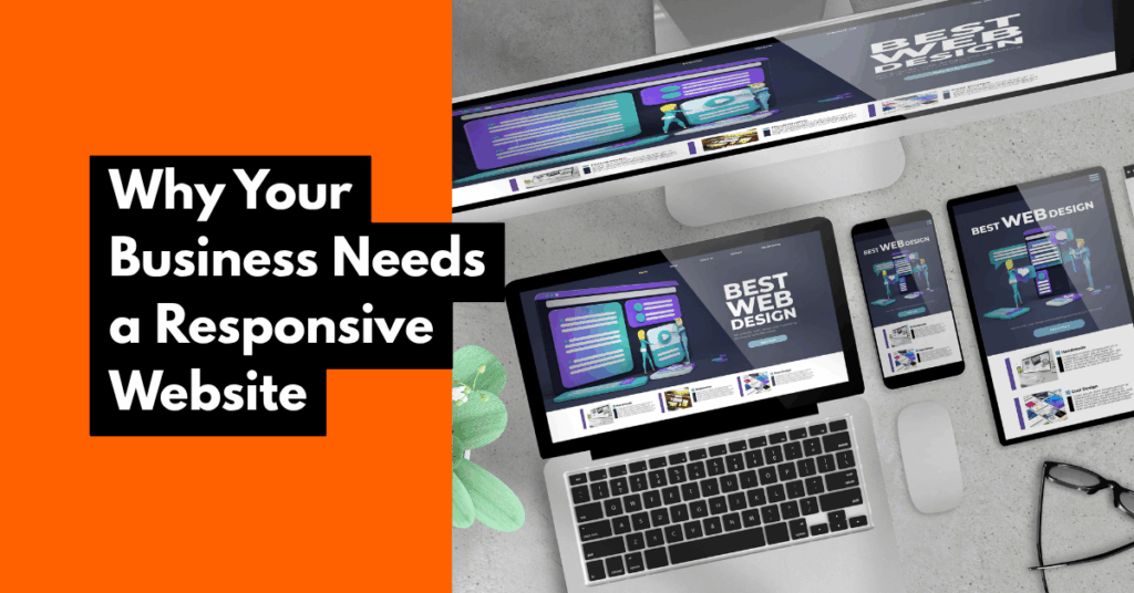
What Does “Responsive” Actually Mean? A responsive website automatically adjusts its layout, content, and elements to fit the screen size of the device being used—whether that’s a smartphone, tablet, laptop, or desktop.
It ensures that:
Text is readable without zooming in
Buttons and menus are easy to tap
Images scale properly
Users don’t have to scroll sideways
Without this, your site will feel broken or frustrating on mobile.
Why Your Business Needs a Responsive WordPress Website
✅ Better User Experience
A smooth mobile experience keeps visitors on your site longer, which reduces bounce rate and increases trust.
✅ Higher Search Rankings
Google uses mobile-first indexing, which means mobile performance heavily influences where you rank in search results.
✅ Increased Conversions
When your site loads quickly, looks clean, and functions well on all devices, people are more likely to buy, book, or sign up.
✅ Supports SEO and Speed
Modern responsive WordPress themes are lightweight, fast, and optimized for Core Web Vitals—an important SEO ranking factor.
✅ Consistency Across Devices
A responsive design ensures your branding looks consistent no matter where or how your site is viewed.
Why WordPress Is Ideal for Responsive Design
Offers thousands of mobile-optimized themes (e.g., Astra, Kadence, Hello)
Works with responsive page builders like Elementor and Gutenberg
Easily integrates speed and SEO plugins to enhance performance
Compatible with responsive forms, sliders, and menus
How to Know If Your Site Is Responsive 📱 Open your site on your phone and check:
Is text legible without zooming?
Do buttons work and fit the screen?
Are menus easy to tap and navigate?
💻 Or use tools like:
Google’s search console Mobile-Friendly Test
If your site fails these tests, it’s time to upgrade.
A non-responsive website in 2025 is a credibility killer. If people can’t use your site comfortably on mobile, they’ll bounce, and your business will lose out.
WordPress gives you the tools to build fast, flexible, and fully responsive websites that help your business grow online.
📌 Want help creating or redesigning a responsive WordPress website?


